Rotherham-Based Instantprint Reveal the Perfect Business Card

With business cards still going strong and being a proven method of generating new business, it’s important to understand what type of design and finished look will help attract the attention of new customers. Before you create the artwork and order your next batch, think about the kind of clientele you’re wanting to draw in. We know it sounds like hard work but luckily, Rotherham-based company instantprint have done all the research for you!
So, whether you’re self-employed, own an IT business or run a retail store, let’s talk about what actually makes up the perfect business card.
How did instantprint perform the testing?
There was no stone left unturned when it came to the way in which instantprint performed the tests. With a range of specialist equipment from GazePoint used, the team examined initial reactions, tracked eye movement and also heart rate to find out which elements drew in the attention of those being surveyed.
With the eye-tracking camera, biometrics dial, and heart rate monitor all hooked up to a PC, they then set up testing using seven business card variations per 10 industries. Once the calibration was complete (this was an important part of the process to ensure each test was fair and true), each individual was tested, which lasted around five minutes per person.
What did the tests reveal?
There are so many different elements to a business card. Regardless of how small they may be, business cards hold all important contact information, and their design can reflect heavily on your business and how much you care.
The tests revealed a wealth of information, from which industry preferred bright colours to monotones, and where people liked the text to be positioned. Surprisingly, graphic designers were more attracted to more neutral and primary tones than anything too drastic, and none of them reacted well to centralised logos!
On the flip side, hairdressers and barbers, being stylish themselves, unsurprisingly loved both monotone and bold colour schemes. They also liked large logos that took up the majority of the design – is this because they often let their hairstyles do the talking?
What can we all take from the results?
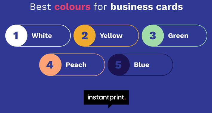
It’s important to think about the finished look and feel of your business card – not listening to your audience or typical client could result in a lack of new business after all! The research found that yellow and white were the most attractive colours when it came to the background.
With yellow being a bright and cheerful colour, it’s no surprise that this was among the top two. And, if your brand’s personality and ethos represent pureness and precision, then white is the colour for you.
Before you design your next business cards, think carefully before you get started. Take a look at instantprint’s extensive research. After all, it could help you land some new clients and customers.


