How to Choose Typography for Lifestyle, Travel, and Culture Brands
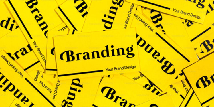
Lifestyle, travel, food, culture, and local magazines all have the same design challenge: they need to feel inspiring without becoming hard to read. A reader might open a restaurant review, scan a weekend guide, compare hotel ideas, browse theatre coverage, or save a fashion feature for later. The typography behind that content shapes how quickly the reader understands it and how much they trust it.
Choosing fonts for a lifestyle brand is not only a matter of taste. The same type system may need to support long-form articles, event listings, image captions, maps, newsletters, sponsored features, social graphics, menus, and downloadable guides. A beautiful headline font can create atmosphere, but the body text, captions, prices, dates, and practical details still need clarity.
Use this guide to build a typography system that works across lifestyle storytelling and practical information.
Define the editorial job before choosing a font
The first step is to decide what the typography needs to do. A lifestyle magazine does not publish one kind of information. It may move from culture interviews to travel guides, from food reviews to interiors, from fashion advice to local business profiles. Each format asks the reader to behave differently.
A theatre review may need elegant pacing and readable quotations. A hotel feature needs clear names, locations, amenities, and prices. A food article may include menus, opening times, reservations, and allergen notes. A travel guide may need transport details, distances, dates, and safety information.
| Content type | Reader need | Typography priority |
|---|---|---|
| Travel guide | Compare places, routes, timing, and costs | Clear headings, readable body text, strong numerals |
| Restaurant review | Scan dishes, prices, location, and atmosphere | Readable captions, menu details, and short sections |
| Culture interview | Follow quotes, names, and context | Comfortable paragraphs and clear quote styling |
| Fashion or beauty feature | Understand trends, products, and recommendations | Expressive headings supported by practical text |
| Local event listing | Find dates, venues, times, and booking notes | Reliable numerals and visible labels |
Before opening a font menu, write down the most common content tasks. If the font helps those tasks, it belongs in the system. If it only looks good in a hero image, use it carefully.
Match typography to the content category
Lifestyle content needs personality, but different categories need different levels of restraint. Travel and culture can handle more atmosphere in headings. Food, health, shopping, and event information usually need a calmer structure because readers are making practical decisions.
| Category | Good typographic direction | What to avoid |
|---|---|---|
| Travel | Warm editorial headings with practical body text | Decorative fonts for maps, prices, or safety notes |
| Food and drink | Friendly headings, clear menu details, readable numerals | Tiny captions or unclear prices |
| Arts and culture | Editorial rhythm, strong quotes, refined spacing | Long paragraphs with weak hierarchy |
| Homes and interiors | Calm, spacious text with elegant accents | Thin fonts that disappear on mobile |
| Fashion and beauty | Distinctive display type with clean product information | Using a trend font for every paragraph |
This does not mean every section needs a different font. In most cases, one strong body font, one heading style, and one accent style are enough. The difference comes from scale, spacing, image treatment, and how each font role is used.
Separate display style from readable text
A common mistake is choosing a single expressive font and forcing it into every role. A dramatic serif, condensed sans, handwritten face, or retro display style may look excellent in a magazine masthead or feature headline. That same font may fail in captions, event times, hotel details, or mobile navigation.
Build a small type system instead. Give each typographic role a job.
| Type role | Best use | Risk if misused |
|---|---|---|
| Display type | Feature headlines, covers, campaign graphics | Long reading becomes tiring |
| Text type | Articles, reviews, guides, interviews | Brand may feel flat if it has no supporting style |
| UI type | Navigation, buttons, filters, search, newsletter forms | Decorative shapes slow users down |
| Numeric style | Dates, prices, ratings, room numbers, distances | Ambiguous numerals create confusion |
| Accent style | Pull quotes, tags, badges, short labels | Overuse makes the page noisy |
For a lifestyle publication, this structure keeps the magazine feeling polished without sacrificing usability. Readers still get the atmosphere, but they can also find the details they came for.
Choose between free, commercial, variable, and custom fonts
Free fonts are useful for early concepts, personal projects, and quick editorial experiments. They are not automatically wrong. The problem begins when a project becomes commercial and the team has not checked quality, language support, weights, web performance, or licensing.
Professional lifestyle brands often need deeper families. A good commercial font can offer multiple weights, italics, language coverage, web licenses, and consistent quality. Variable fonts can add flexibility for responsive layouts. Custom fonts become useful when a brand needs a more ownable voice across many touchpoints.
| Font option | Best for | Main advantage | Main risk |
|---|---|---|---|
| Free fonts | Early concepts, moodboards, personal posts | Fast access and low cost | Overuse or unclear commercial rights |
| Open-source fonts | Accessible projects and simple websites | Easy distribution | Still requires licence review |
| Commercial fonts | Professional magazines, campaigns, websites, and newsletters | Quality, family depth, clearer licensing | Requires budget and tracking |
| Variable fonts | Responsive websites and flexible editorial systems | Adjustable weights or widths | Needs careful implementation |
| Custom fonts | Established brands, publishers, apps, and large campaigns | Distinctive identity and long-term consistency | Higher cost and longer timeline |
Editors, designers, and brand teams comparing professional font families, variable fonts, or custom typography options can review foundries such as typetype.org when they need type systems that can be tested across websites, newsletters, guides, packaging, campaigns, apps, and brand materials.
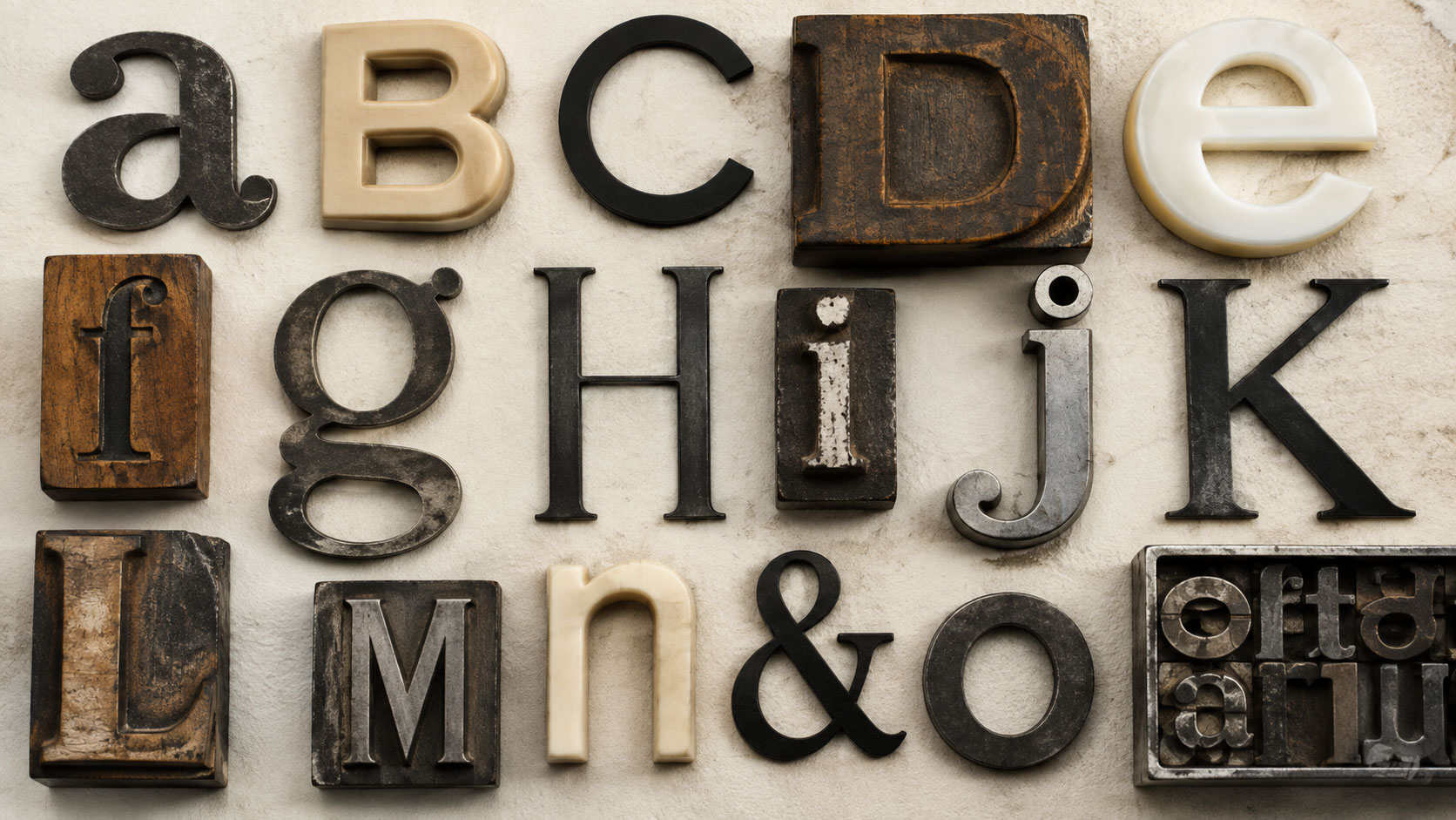
Learn from real custom font cases
Custom font projects from large brands are useful because they show how typography solves practical communication problems. Lifestyle publishers may not need a custom typeface immediately, but the lessons transfer well: consistency, recognition, readability, and licensing control.
Dominos Sans for Domino’s Pizza
Domino’s Pizza customized TT Commons™ Pro into Dominos Sans Display and Dominos Sans Text. The lesson for lifestyle and food publishers is consistency. A restaurant, food guide, or hospitality brand may need the same voice across menus, packaging, ordering flows, advertising, newsletters, and local listings.
TT Hazelnuts for LEG
LEG Immobilien uses TT Chocolates and a customized version of TT Hazelnuts as corporate fonts. This is relevant to homes, interiors, and property content because housing brands need typography that feels approachable while still supporting serious information such as locations, contracts, and resident communication.
TT Fors for Plugsurfing
Plugsurfing uses a tailored version of TT Fors. For travel, transport, sustainability, and mobility brands, this kind of customization shows how a geometric type system can support a modern service while staying practical for digital interfaces and customer communication.
Plan font licensing before publishing
Font licensing should be part of the planning stage, not a last check before launch. Fonts are software, and the license defines where and how the typeface may be used. A lifestyle brand may use the same font on a website, newsletter, PDF guide, printed magazine, social campaign, video, event poster, or merchandise.
| Use case | Licensing question |
|---|---|
| Website | Can the font be embedded as a webfont? |
| Newsletter graphics | Are commercial digital graphics covered? |
| Downloadable city guide | Can the font be embedded in a PDF? |
| Printed magazine or brochure | Are print and commercial uses included? |
| Logo or magazine masthead | Is wordmark use permitted? |
| Mobile app or booking tool | Does the license allow app or software embedding? |
| Social ads and video | Are paid campaign and motion uses covered? |
| Contractors | Can font files be shared with freelancers or agencies? |
Common licensing mistakes
- Using a personal-use font on a monetized website;
- Using a desktop license as if it were a webfont license;
- Embedding fonts in a PDF, app, or template without checking rights;
- Sharing font files with contributors without permission;
- Using one license across several client brands;
- Modifying letters without checking the EULA;
- Losing license receipts before a redesign or campaign audit.
These mistakes can stay invisible during a simple mockup, but they can become serious during a rebrand, commercial partnership, advertising campaign, acquisition, or legal review.
Avoid common typography mistakes
Most typography problems happen when a page is judged only by atmosphere. Lifestyle content has to survive mobile screens, image-heavy layouts, long names, changing events, sponsored disclosures, affiliate links, and practical reader needs.
| Mistake | Why it hurts | Better choice |
|---|---|---|
| Using decorative fonts for body text | Long reading becomes tiring | Reserve expressive fonts for short display moments |
| Making captions too small | Images lose context and credibility | Use visible captions with consistent spacing |
| Choosing unclear numerals | Dates, prices, and times become harder to trust | Test 1, I, 0, O, 5, and currency symbols |
| Mixing too many fonts | The publication feels inconsistent | Limit the system to defined roles |
| Placing text over busy photos | Readability drops on mobile | Use overlays, contrast, or separate text blocks |
| Ignoring accents and local names | Place names and people’s names may render poorly | Choose fonts with the right language support |
| Checking licensing at the end | Launch may be delayed | Confirm rights before design approval |
Build a simple workflow for choosing fonts
A practical typography workflow keeps the process from becoming subjective. Instead of asking only whether a font looks stylish, test it against real editorial and brand situations.
- Collect real content samples: headlines, long paragraphs, captions, dates, prices, names, and event listings.
- Test the font on mobile, desktop, email, and printed or PDF layouts.
- Compare numerals, punctuation, accents, and long place names.
- Define roles for headings, body text, captions, buttons, and accents.
- Check loading performance if the font will be used online.
- Confirm licensing for web, print, PDF, app, video, social, and contractor use.
- Document the final choices in a simple brand or editorial style guide.
Final checklist for lifestyle and travel brands
| Question | Why it matters |
|---|---|
| Can readers scan the page in a hurry? | Lifestyle readers often browse between tasks |
| Does the font support long-form reading? | Reviews, interviews, and guides need comfort |
| Are dates, prices, and locations clear? | Practical details drive trust |
| Does the system work with photography? | Lifestyle layouts are image-heavy |
| Can the font handle local names and accents? | Travel and culture content often includes multilingual details |
| Are commercial rights documented? | Publishing and partnerships require license clarity |
| Can the system scale to newsletters and social templates? | Modern lifestyle brands publish across many channels |
FAQ
What is the best font style for a lifestyle magazine?
There is no universal best style. A lifestyle magazine usually needs a readable text font, a distinctive heading style, and a restrained accent style. The best choice depends on the mix of travel, food, culture, fashion, homes, and local content.
Should travel and culture brands use custom fonts?
A custom font is useful when a brand needs a distinctive voice across many touchpoints, such as websites, apps, guides, newsletters, campaigns, signage, and merchandise. Smaller brands can often start with a professional commercial font family.
Why do numerals matter in lifestyle typography?
Lifestyle content often includes dates, prices, ratings, opening hours, distances, room numbers, recipe measurements, and event times. If numerals are unclear, readers may misread important details.
What should be checked before using a font commercially?
Check whether the license covers the exact use: website embedding, print, PDFs, logos, social ads, video, apps, templates, and contractor access. Save license documentation with the brand assets.