Here’s What Interior Colour Trends Are Looking Like, According to the Experts
Most people think they know the drill when it comes to home colours: whites, greys, maybe a navy wall if you’re feeling adventurous. But the truth is, the world of interiors is full of little secrets that don’t always make it into glossy magazines or Pinterest boards. When we sat down with a designer who works with Yorkshire families, the advice wasn’t about chasing trends: it was about how colours actually behave in this part of the world, with its sharp light shifts, stone houses, and lived-in spaces.
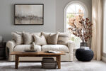
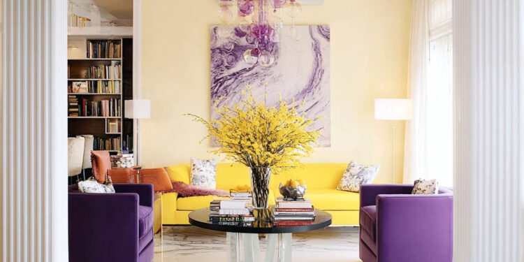
Take something as simple as a kitchen stool, a hallway radiator, or a B&B Italia sofa: swap out the shade and suddenly the room tells a completely different story. We spoke with a Yorkshire-based interior designer, and they revealed the two colours they’re seeing transform homes this year: purple and yellow. Not the predictable pastel shades, but deep, rich, versatile tones that interact beautifully with northern light, local stone floors, and timber beams.
Deep Purple: Calm, Sophisticated, Transformative
Purple isn’t just for feature walls or trend pieces: it’s a surprisingly practical colour when used correctly. Our expert loves deep plum, aubergine, and muted violet in lounges, studies, and even kitchens. In north-facing rooms, where natural light can feel flat, purple adds depth and richness without darkening the space. In lounges, a plum accent wall or a Saba couch in velvet transforms the room from “just furniture” to a space that actually draws people in. Even studies or home offices benefit from aubergine walls: they calm the eye, absorb distractions, and make the space feel intentional. Purple pairs beautifully with natural textures: oak flooring, stone hearths, or linen curtains, all common in British homes. The secret is layering shades rather than going solid purple everywhere. Even a set of deep violet cushions or a painted door adds character without overwhelming the room.
Mustard and Ochre: The Unexpected Color Choice
If purple grounds a room, yellow energises it. Mustard or ochre works wonders in areas where family life happens: breakfast nooks, hallways, or reading corners. East-facing kitchens get a soft ochre to catch the morning light, giving the room a subtle glow before the Yorkshire mist sets in. Mustard accents in Paola Lenti cushions, Flexform side tables, or a statement De Sede chair bring warmth to dimmer rooms, balancing the depth of purple. The designer’s advice: pair yellow with purple for contrast that feels intentional, not jarring. Even small interventions (a mustard bench in a hallway, a vase, or a painted shelf) can shift the whole mood. Texture matters, too: matte ochre walls, woven cushions, or terracotta pottery work best, creating a tactile richness that complements the visual punch.

Purple and Yellow for Interiors: How the Interior Designers Do It
The trick isn’t slapping purple on one wall and yellow on the next; it’s about layering and context:
- Anchor with purple: sofas, cupboards, shelving, or a study wall. It gives a sense of depth and sophistication.
- Inject yellow strategically: cushions, side tables, a small feature wall, or a breakfast nook. Points of energy that balance the calm of purple.
- Use neutral buffers: soft cream, putty, or pale stone for walls, ceilings, or floors to keep the palette from feeling heavy.
- Consider light and room use: north-facing rooms can handle deeper purple tones; yellow energises darker, shadowed corners.
- Small details make a difference: a purple-painted door frame or a mustard skirting board gives the space a bespoke feel without major renovations.
This combination does more than look good. Purple zones calm stress after school runs or workdays, while yellow spots energise mornings and casual family interactions. Our interior designer’s point is clear: colour isn’t decoration, it’s a tool. Deep purple and mustard yellow aren’t trendy for the sake of it. They work because they interact with light, materials, and human behaviour. Start small if you’re nervous: a cushion, a chair, or a painted shelf. See how it changes the way you feel and use the space. Then scale up gradually (sofa, cabinets, or a feature wall). Before you know it, your home won’t just be decorated; it will be choreographed. Colour becomes a secret your house shares back with you every day: calm where you need it, energy where it counts, and a sense of personality that goes far beyond neutral paint.